Friday, April 5, 2013

Schematisation in Visual and Tactile Maps

When construction tactile maps schematisation is one way to ensure that the map is easy to understand. In my talk about "What the Quest for Tactile Maps Can Teach Us about Making Interactive Maps" (download Extended Abstract & Presentation) I took the example of the London Underground to show the importance of schematisation for human conceptualisation of space.

In the beginning there was a veridical London Underground map in which geometry and topology were preserved, i.e. the maps is very similar to the geographic environment (from 1908).

London Underground map from 1908
Source: Wikipedia (http://en.wikipedia.org/wiki/File:Tube_map_1908-2.jpg)

From 1931, Harry Beck started to rework the tube map realizing that any the topology of the network  (e.g. connectivity, neighborhood relations) was important not so much its geometry (e.g. distances, angels). So he introduced the schematisation of the intersections to be quadlinear (i.e. all angles are abstracted to 90° and 45°) and the conncection between intersection to be straight (with some roundness at corners):

A low resolution image of Zone 1 of Transport for London's London Underground map.
Source: Wikipedia (http://en.wikipedia.org/wiki/File:TubeMapZ1_TFL.png)

There were several suggestions for improving the Beck map (and its successors) as with the schematic map it was hard to estimate distances or direction between stations. Recently, the idea of maps that are less schematic but that make it easier to match the geographic reality to foster comprehension by the users has gained some attention. Relaxing the constraints of straight lines only and multiple of 45° angles only can produce more veridical (and less schematic) maps like this one by James D. Forrester:

Source: Wikipedia (http://en.wikipedia.org/wiki/File:London_Underground_Zone_1.svg)

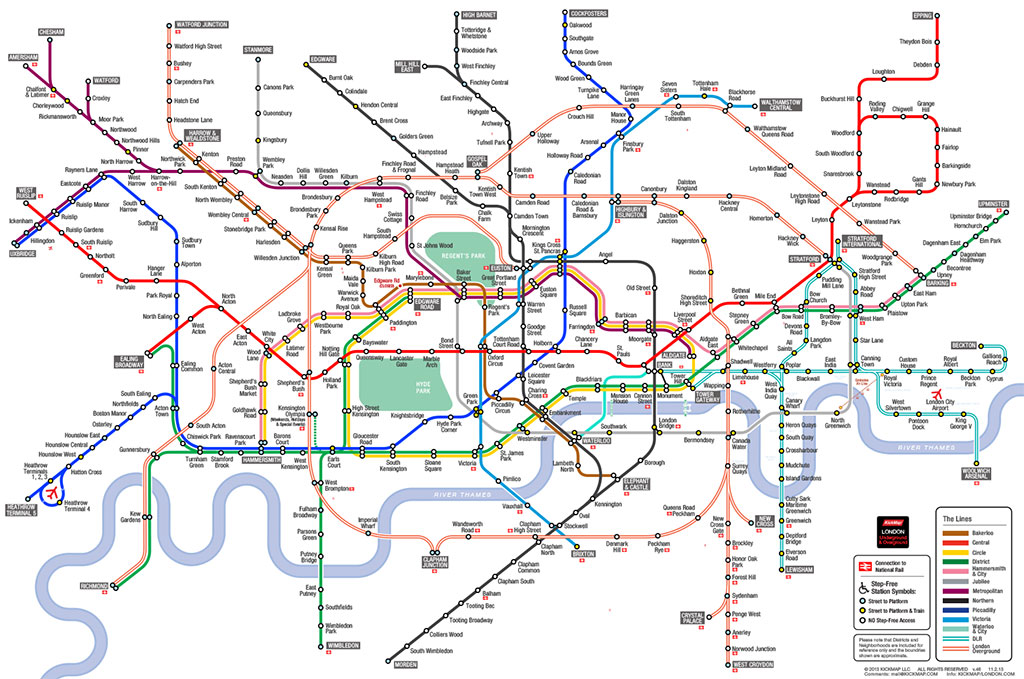
The KickMap of the London Underground by Eddie Jabbour is another, more recent example. The development was motivated by the fact that the modern underground map has properties that make it hard to understand, for example, how above ground landmarks relate to undergound lines:
"Contributing to the confusion is the trend of modern Tube Map designs to be even more abstracted than Beck's original, resulting in a severe disconnection from the above-ground geography of London. This unfortunate drift is apparent by looking at London's geographic anchor, the River Thames, and its relation to stations as drawn by Beck, and comparing it to the present Tube map's Thames rendering and its relation to stations. Indeed, a few years back the tendency toward abstraction culminated in the Thames being removed entirely from the official Tube Map." (KickMap of the London Underground)
See this O'Reilly Radar post to understand the inspirations, the constraints, the trade offs, the multiple iterations that went into the final design.
Source: KickMap London (http://www.kickmap.com/London/images/KMAP_LONDON_SMALL_lg.jpg)

Another map that set out to enhance the current underground map is the London Tubemap by Mark Noad. As well as the KickMap, the TubeMap is not only topologically correct but preserves the geometry as much as possible to ensure that "the stations are geographically-accurate in relation to each other" (http://www.london-tubemap.com/about_the_map.php). On the downside there are more information in the map that the user needs to proces cognitively, for example, different slopes of lines and even freeform shapes of lines.

In my PhD I discuss what kind of schematisations could facilitate the comprehension of tactile orientation maps that are produced with a tactile printer. I tested different levels of abstraction that resulted in schematized maps (see below) and their effect on map understanding.


The thesis is to be published soon. Articles and presentation of the work can be found here.

Wednesday, April 3, 2013

Tactile Displays go mainstream?!

The adaptionof current research into the realm of consumer products is a clear sign for me that tactile and haptic technology is the next big thing in human-computer interaction. See the following articles (to be extended):

Tuesday, February 19, 2013

Presentations about "Maps for Handicapped People" @ ICC 2001

D.R.F. Taylor (Canada) 

Maps for the Blind and Visually Handicapped
Izabella Krauze-Tomczyk ,Jolanta Korycka-Skorupa (Poland)              

Tactile Campus Mapping: Evaluating Designs and Production Technologies
Chris Perkins (United Kingdom)

How to Make Tactile Maps Discriminable for Touch?
Yvonne Eriksson (Sweden) 

A F Tatham (UK)      

Cecília Maria OKA ,Carla Cristina Reinaldo de SENA (Brazil)             


Eva Siekierska, Richard Labelle, Linda ONeil (Canada)                


Kostas Papadopoulos, Chryssoula Boutoura, Evangelos Livieratos (Greece)

Schematisation of routes in another PhD project

A blog I reguarly read for the pure joy of cartographic material is Beagraphy, written by Beate Weninger. She is a doctoral student of geography from Graz who is doing her PhD about the usability of noise maps in Hamburg. We sometimes meet at the UX roundtable where she presented her former project about 'accoustically enhanced maps'.

Beate's latest post pointed my to the project 'Literaturatlas', co-headed by Lorenz Hurni of ETH Zurich, whom I visited five years ago to speak with him about his work on terrain models, especially reliefs for the blind. The Literaturatlas is a cartographic visualisation of places and routes that are mentioned in literature (see the motivating scenario).

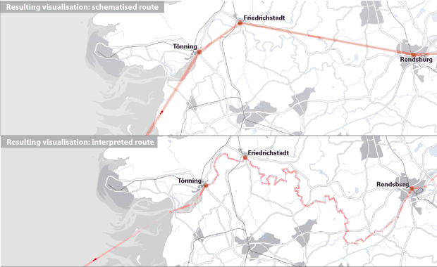
Amoung other visualisation techniques, schematised routes are used to clarify the arbitrariness of routes (in German) when only some (vague) waypoints are mentioned in some text. The concept of schematisation is used here in a similar way as in my dissertation albeit applied to routes not to whole street networks.


This is the first time that I see the term schematisation used outside of my research group to describe the process of map abstraction. Although it used here to describe a visualisation technique (in cartographic terms, that is generalisation) it is similar to the drawing people produce when externalsing the cognitive schematisation that happens in their minds when listening to route descriptions or reading tactile maps with their fingers.

Wednesday, February 6, 2013

heise.de berichtet über Navigation für Blinde

heise.de, eins der starken (und m.M. guten) online-Leitmedien, hat heute über die Navigation für Blinde berichtet, ein Anlass für mich, dies auch hier kundzutun. Ich freue mich besonders über die Berichterstattung zu diesen sonst eher als Randthemen eingestuften Arbeiten. Da kann man sicher sein, dass es auch Aufmerksamkeit bekommt, wie ich an zwei unabhängig bei mir eingegangen Mails sehen konnte, die mich auf den Artikel aufmerksam machten.

Ergänzend dazu noch ein paar Links zu einer Technologie, die den Ansatz der Sinnessubstitution verfolgt, allerdings nicht unbedingt auf Navigation ausgerichtet:
  1. The vOICe - Seeing with Sound (Peter B.L. Meijer)
  2. Seeing with your ears (Michael Proulx, Bath University)
  3. Mit den Ohren sehen - die Hörbrille (ARD Sendung)
Neben der Sinnessubstitution gibt es unter bestimmten Voraussetzungen auch die Möglichkeit, den Sehsinn mittels Sensor im Auge und Chip im Gehirn wieder herzustellen.